Friday 28 February 2014

Magazine ad process and alternative cover design

Magazine ad process


Above is an image showing the development of my magazine ad via photoshop. Firstly I developed the overall compostion of the ad and then applied my album artwork via a layer mask. The next stage was applying type and other graphical elements such as the retro rainbow pattern which was developed by layering different coloured vector rectangles together. I then went onto adding details such as the record label and distributor logo to which I also edited to fit in with the overall theme of the ad. Additionally as I was developing my ad I found some that I had some unwanted empty space to which I filled with lorem ipsum (dummy text) to serve as a place holder until I could work out what I wanted said text to say.

Finally after working I then added a distressed paper texture to age the look of the design to make it look more "retro".

When working on the ad I also slightly edited my album art to fit more with the overall theme of the ad however, I like the look of this edit that I decided to experiment with said edit and see if I could develop this into some sort of alternative cover of sorts.

Original on left, ALT on right
In the alternate cover I have adjusted the type of Burnin fever to make it more readable as well as add in a more darker atmosphere as originally planned to which I feel does a better job in drawing viewers attention towards the robots identity. The only problem I have with this alternate design is it seem a bit too dark to convey a electronic album as compared to the more vibrant look of the original. I am currently debating whether this alternative cover should serve as the main final cover or perhaps if I had the resources and time make some sort of "special edition" digipak which features like an extra track or two as well as a cover which changes when you view it from another direction which I believe is described as a lenticular cover based on this link here.

Below is how I would envision how this could look

I like how it seems like the image glitches out - this would work well in further exploring the glitch aesthetics of my music video


Digipak artwork development

Digipak artwork development

During this post I will discuss how I approached the design of my digipak via photoshop as well as other external software. Firstly, when producing my front cover, I needed to take new photos to in order to follow my draft design. During said photoshoot I took a range of photos each from different angles and lighting styles to allow me more choice of images when working with my front cover. Below are 10 examples of the various photos taken to use as possible photography to work from for my front cover.

 
My decision for choosing the right photo was based on the type of lighting (whether it was too dark or the robot face wasn't visible enough ), composition of the image (did the image feature my desired chaotic look and draw viewers attention towards the robots face) and how easy it is to work with in photoshop (overall image quality.

Finally after deciding on the most suitable photo based on these features I started to edit my image via photoshop as well as using a bit of  adobe after effects to which I will explain more when discussing how I produced the look of my internal panels.

Front cover

Firstly In Photoshop I adjusted the lighting of the photo to further direct viewers gaze towards the computer and the imagery around it by adjusting the levels of the photo and then selecting the area in which we see the toy soldiers ( which I envisioned as where the glow of the computers light would lie) and increased the saturation of this selected area in order for the soldiers and mess to stand out more for audiences view.


I then imported the image to a 5.5 x 5 canvas (the dimensions of a digipak) and decided to move onto type. However when reviewing the image itself without any type I felt that the image was too dark and didn't feature enough visual conventions to communicate not only the bright tone of my video but also connote an electronic based genre. So using my knowledge of the visual conventions of electronic genres, I applied a glitch effect via After effects to convey not only a brighter look to my front cover but also a neon light effect to communicate the glitch themes of the music video. Moreover, this would communicate the energetic sound of the song attached similar to how other electronic genre music graphics use this visual style of vibrant colours and neon lights like many of electronic ads I had previously analysed.

Next, I started to work on the type for the front cover by firstly altering the font "true lies" on Photoshop using its text wrap features to adjust the font to look more like my artists logo. After this I then applied the album name with the title of the artist "burnin fever". After experimenting with a range of fonts in a previous post I decided the font best suit the artwork of my album would be TIFAX.


Tifax example
 As previously experimented with I felt that Tifax's  simplistic geometrical style didn't clash with  so much that was going on in the image as well as conveying a computer aesthetic. After choosing the type I then applied a small gltich effect to the type to be consistent with the theme presented and then applied a scanline filter to bring more vibrancy to the colours to further convey this electronic genre look to my front cover.


Internal panels


Above is an example of how I would approach the design of my internal panels for my digipak. Firstly I would correct any mistakes I would find in the image via clone brush tool. In this case I didn't quite like the part of the sink seen within the image. I would then export the image into After effects and use the gltich filter used in my music video on said image and finally export the image back to photoshop for me to overlay onto the original to create a more saturated and distorted image. Then I would apply a mosaic filter onto said image making the image look intentionally pixelated. The intention behind this was to make some sort of software or video game graphic look to the image as previously established in this post. I then applied a black background and type to convey a classical video game hud look to the image. One point worth mentioning, is that in these internal panels where it says "time left:" and there is a number attached, the number attached refers to the time taken off the full running time of my video 3:52 mins to the exact or similar frame in which you see the image in said slide. To put it simply if you were in this example remove 18 seconds from the running time of my video on some sort of video player it will refer you  roughly to the image of seen in the internal panel. This was done for the purpose of pushing the synergy between the two products as well as add some significance to the numbers chosen.

*Not the best example it seems I am 2 seconds off - this will be rectified in my final draft


Back cover


Inspired by Commadore 64 graphics I decided to stylise my back cover in said theme in order to continue the computer based theme of my digipak. Using photoshop I mainly worked with vector shapes and pixelated type to recreate the style. In terms of other graphical features such as the record label logo and barcode I simply recoloured theme to fit in visually with the overall style of the image. Additionally, I added the artists contact details to allow for audiences to contact said artist similar to how other digipak's include such a feature to constantly promote the artists works and allow audiences to follow said artist. Moreover I also included a simplified image of the robots face to link in with the imagery of the front cover as well as to constantly promote my artists "substitute image". Finally, I added a scanline effect to the image to make it look like it was set within a computer screen.

Thursday 27 February 2014

Magazine ad

Magazine ad


Above is a draft design of my magazine ad. After researching fonts via pinterest and fonts in use, I decided to use the font named "harry" since from my research I had found was used in many 70's/80's graphics. By using said font I intended to convey a retro 80's type of computer ad look to my magazine ad in order to both use the visual convention of alluding to the 1980's found within my chosen genre but also to keep with the computer theme based themes of my digipak.

In the ad itself, to keep the retro theme consistent I also adjusted the apple logo in the "available on iTunes" graphic to look like the second apple logo used during the late 70's and throughout the 80s.


Finally, while developing my digital draft I had found that unlike my plan there was a large amount of unwanted empty space in between the release date and title of the album. So to fill said empty space using what I had learnt I decided to including fake quotes and external promotions playing on album ad conventions in order  to reference my music video's humouress tone as well as reference two prominent lyrics and people such as Alan Partridge and Frank Sinatra in the print ad thus improving synergy between products.

Digipak net and draft

Digipak net and draft


Above is a draft net version of my digipak for my artist produced via photoshop and inDesign. Initially for the front cover I had planned to use an old computer monitor to convey a retro tech look which from my research I had found to be a visual convention of my chosen genre and similar genre's. However due to external factors I had found it quite hard to find an older type of computer to use and thus I had to rely on a more contemporary type of screen due to ease of access. This however still allows me to use the visual convention of technological themes to allude to my chosen genre. 

For the front and back cover I found in order for me to achieve a similar look to my draft sketches I had to do another photo shoot in my schools dark room to achieve the lighting style as previous discussed in my front cover draft post as well as to serve as a blank canvas for me to work from.

During the shoot I ran into many problems, one in particular was getting the monitor to play the image of the robot since the computer used in the image isn't an actual working machine but rather an old computer tower I had found in the room, a keyboard and a separate monitor. To solve said problem, I connected the monitor to my laptop to screen share with my laptop and placed it off camera.

After producing the net in inDesign, I then printed out the net and constructed it allowing me to see how well the artwork compliments each other as well as see if there are any mistakes or changes that I would like to make in the future.


Looking back so far I think I have found some success in carrying a computer based theme within my digipak as well as the placement of my artwork. However I think would improve on this by adjusting the back part of my digipak slightly since the image used is a photo of the monitor playing the a title card I had designed in photoshop which has resulted in a dark look making it hard to read the actual text or details within the card.

Back cover designed in photoshop
For my final product I think it would be best that I use the image above and edit on photoshop to make it look like its being played off a screen in order for the text to be readable.

Finally when discussing the back cover, the chosen songs attached are titles of the artists past and current works. I've decided to use these track names as of now since I am currently awaiting response from my artist about what songs he would like to attach.


Monday 24 February 2014

Draft version of Magazine ad + fonts I would like to use


Above is a slide share presentation of a draft version of what I would like the outcome of my magazine ad to look like. Please could you full screen and zoom in using slide share to examine my annotation if need be. Annotation circled in red " Extra type" refers to the inclusion of a small statement on the album art to further convey this "retro computer ad" look to the graphic.

Said statement as of now is likely to be "and the electrifying synthetic sounds of burnin fever". This statement is intentionally to be, sort of "chessy" to not only convey a retro tone but also convey the humorous tone of the music video attached to the digipak and thus carry on the synergy between the products.

Below is a pinterest board of fonts and graphics that I have examined for potential use for my ad to convey this retro tone.


Sketches for magazine ad

Sketches for magazine ad
 
 
After establishing a theme I would like to explore and developing a mood board for said theme for my magazine ad below are a range of sketches planning out the look of my magazine ad for my digipak.


Sunday 23 February 2014

Magazine advertisement idea + mood board

Magazine advertisement idea + mood board

After researching Magazine advertisements for Digipaks in terms of design and layout I had found that many of these covers would either feature the main artwork of the front cover of the Digipak as the central image of the advert to allow for magazine readers who are most likely to miss the ad to instantly be engaged in the image as well as quickly understand what they are purchasing or feature a minimised version of the album art in order to not only engage readers via its imagery but also fit more information about the viewers potential future purchase. Other features noticed would be the use of a Z formation format or a listing format in terms of organising elements. Normally this would consist of artists name top and centre, album artwork, release date and then extra information such as distributors, record label and artists website.

However for my magazine advertisement I would like to use these element but rather stylise my magazine advertisement in the form of retro computer ads to keep with the retro computer theme established by the draft artwork and design of my digipak so far. This I feel will keep strong synergistic qualities towards both products similar to the relationship between other digipak and magazine ad products as well convey a tech look to both of my products which should in turn make use of my chosen genres visual convention of technology based motifs and thus communicate the genre to audiences stylistically and effectively. However, one problem I do face when exploring this style is the possibility in creating confusion in the type of product being sold to audiences. I need to make sure I blend the best of both styles in order for this to convey this style of advertisement without loosing the main purpose of the graphic.

 Below is a mood board of the graphics I wish to use as inspiration.

I have noticed a lot of these ads are very text based and tend to feature the use of borders around the main product they are selling and then feature information about the product outside these borders. To communicate a retro design for my magazine ad, firstly I may wish to find similar retro fonts used in these ads as well as adopt the border based approach seen throughout. As of now I feel that adopting the text based style of these ads wouldn't fit my own product as too much information may overwhelm those examining the product as well as any extra information other than title and release date, distributors, label and awards etc. would be pointless and irrelevant in achieving the purpose of a magazine ad for a digipak, which is to sell

Thursday 13 February 2014

Understanding 6 panel Digipak and organisation of internal slides


Understanding 6 panel Digipak

Before I go on to develop the internal artwork for my Digipak, I decided to firstly form a mock 3d model a six panel Digipak to understand where the artwork panels are placed so I can think about which artwork would best compliment each other. In terms of the internal artwork I have considered the possibility of using the photos from my music video photo shoot however editing them to make them feature more of a computer theme for example utilsing the gltich filter or perhaps using a pixelisation effect to the images to make them look like computer software graphics. Another option I think would work well in continuing the computer theme of my Digipak similar to the cinematic theme seen in the Kavinsky album is to edit the photos from my photo shoot and make them look like old video game graphics with a pixel effect and video game hud. This way I carry on the theme of computers by presenting the look of the digipak zooming in on the computer monitor presented on the front cover.

To explain this further
  • On the front we see a computer monitor covered in confetti 
  • On the back its a close up shot of said monitor
  • Inside of the digipak, the internal artwork will connote the programs this computer is running or the burnin fever virus
Additionally from my Daft Punk audience research I had found that this audience are consumers of video games therefore when thinking about targeting this audience, this intertextual reference to the medium should appeal to said audience who were one of my potential audience's for my music video.


Now with a 3d modeled 6 panel digipak in front of me this allowed me to organise the placement of each type of internal artwork for the digipak and see which ones compliment each other the most. Below is a presentation of me mind mapping ideas for the placement of each photo.


When choosing the internal panel artwork, firstly I felt that the image must convey a theme of chaos or show some sense of the surreal to communicate themes of the music video successfully. This was my reasoning behind not considering certain images from my photo shoot in the slide above as I felt that those that weren't chosen either didn't convey a motif or theme seen in the video for instance the visual motif of Frank Sinatra or didn't feature enough anarchy or strangeness to communicate the tone of the video effectively.

Next I decided to think about which images feature similar themes or type of imagery so that they would compliment each other and emphasise a feeling of mayhem that is seen within the video as well as avoiding one image against another looking out of place.

Now after mind mapping some ideas I attempted to experiment with the placement of these internal atwork slides to find out which photo's actually compliment each other and which don't as you can see in the presentation I did find that I had alternative options to go by.

The image of the manikin although featuring similar imagery of confetti feels too out of place due to how different the image on the left seems compared to the manikin


Improvement- both images feature similar composition and elements such as the confetti and toy soldiers as well as communicating themes of mayhem. Not only this but the image on the right features imagery of the robots head and does well in continuing to promote the artists identity or substitute identity. However the image on the right is low res, if type of image used I may need to either find the original footage of said scene and make it into a jpeg or perhaps re shoot similar type of imagery.


May work as well since it appears like a close up shot of the image on the left however lacks the chaotic look of the previous one which worked well together with the image on the left in communicating the tone of the video.


When thinking in terms of the synergy between the photos, I find that focusing on rather the synergistic qualities of the image on the left and right rather than all 3 should be my focus since I find that focusing on the synergistic qualities of the two isnt less than focusing on all 3 and in addition I would like to end the viewers viewing experience with an image of the Robot's face in order for the Robot ( and substitute artist image) to be the first and last things viewers see in order to increase memorability of the artists persona and profile. I find that the image above when placing the manikin with the barbie doll just like the previous experiment with the manikin head and barbie images doesn't really fit together as the two are so different in terms of composition, perspective and imagery and hence I don't feel as if I should use this image.

This is much more of an improvement- both images left and right feature similar compositional elements and perspective which I find compliment each other. Additionally the image on the right communicates the Frank Sinatra theme present in the video as well as the theme around mayhem albeit with subtly which I find gives the viewers viewing experience a break from all the eccentric and chaotic imagery whilst emphasising the distress and strangeness of the image on the left.

Finally after organising my internal artwork, I have developed a mood board below of retro pixel video game graphics and Hud's to use as visual reference if I am to plan to develop these chosen photo's to look more like software graphics in order to present the look of the digipak zooming in on the computer monitor presented on the front cover.


Features that seem to be consistent within these huds from commodore 64 games are thick black borders and very simplistic pixel type with stats and numbers - If I were to develop the chosen photos into similar images firstly I may need to apply a subtle pixel effect to the images then add the black background and pixel type to make it look like screens from a software program


Wednesday 12 February 2014

Draft version of Digipak back cover

Draft version of Digipak back cover


After sketching out a few ideas for the back of my Digipak above is a final draft version of the back I plan develop into my the back of my Digipak. Focusing on the idea that the back artwork should relate to the front cover, the idea is to have a close up shot of the computer monitor screen featured on the front of my cover. This time however inspired by computer start up graphics such as the commodore 64 start up, the screen will feature some sort of computer start up screen- this will be the main style of the track list keeping with the computer theme of the front cover as well as being inspired by the synergy of the cinematic theme seen on Kavinsky Outrun.

A visual style I would like to adopt for the tracklist
Another possible style to adapt for the tracklist to continue computerised theme
Additionally I plan for final product I plan to cover the computer in confetti to keep with the imagery of the front cover as well as the theme of chaos and strange imagery present in what I plan to be the final product of the Digipak and also the music video attached. Finally, from my research I found that many back cover's of Digipaks feature the record labels logo somewhere on the product and with this in mind I propose either attaching my artists personal web based record label Meh Rec's logo on the back or perhaps using my research on exploring different artists target audiences I could also attach Breakbot's record label Ed banger records to the Digipak. From my research I felt that Ed banger's focus on illustrative and abstract styles and a direct target towards electronic music fans would better suit the abstract type of music video I was developing which in turn would promote my artist in a similar way

If I were to attach said logos to the back of my Digipak I will stylise them in more of a pixel look to keep with the computer theme of the overall Digipak.

Normal logo on the left - Pixel on the right (May need to exaggerate pixel look in order for it to look deliberate rather than just low res)


Back cover sketches

Back cover sketches
Below is a slide featuring a range of sketches of designs for the back cover of my digipak. From my research on Digipaks I have learnt that the back cover artwork usually relates to or shares a theme with the front cover of the digipak. For instance the consistent movie theme seen throughout Kavinksy's artwork via the stylisation of the track list as a billing block or perhaps as seen on Calvin Harris's 18 months album which uses a zoomed out version of the front covers photograph to serve as the back cover of the Cd album. When taking this in account, I had to design the back to be consistent with my chosen front cover, working mainly with a theme centered on a focus on computer monitors and computer imagery as well blending strange elements to represent the tone and theme of my video as well as to use visual genre conventions of technology to communicate that this digipak does belong to an electronic based genre.

Additionally, I also took in account possibly using imagery from my music video photo shoot and considered using images such as this one to serve as my back cover however with a few adjustments for instance a glitch effect or imposing the image within a monitor to further convey this tech based theme.

Please Zoom in if struggling to see line work clearly

Friday 7 February 2014

Draft version of Digipak cover

Draft version of Digipak cover


After sketching and reviewing a few ideas of what I would like to use as the front of my Digipak,  I decided to think about what was the best elements of the photo of the barbie doll covered in orange juice I took and expressed interest in using as a cover and thought how I could adapt and make some adjustments to it to allow for more of the artists promotion.  In the sketch I produced above I wanted to adapt the chaotic look of the photo of the doll such as the toy soldiers surrounding and object covered in orange juice and confetti and add more of a computer theme to it. This time instead of surrounding a barbie doll I would like the soldiers to surround an old computer covered in orange juice and confetti just like the doll whilst projecting a glitchy version of the robots face. By utilising both chaotic and strange imagery with some computer theme added as well, this I feel would best summarise the theme and tone of my video on print, by representing its computer virus theme and its "random" visuals. In addition this strange imagery of toy soldiers surrounding a computer covered in orange juice and confetti can also represent the personality of the virus in my music video as this will show some of the effects it has as established in the video.


In addition, I was mainly when composing this Digipak design inspired by the graphics of old computer adverts. Particularly in how they place the computers within the canvas of the image to draw viewers attention almost instantaneously as well as the use of a simple dark to colour gradient for the background to further direct viewers gaze towards said product and also present them as futuristic by almost shining a spot light onto these products . One could argue that this would communicate at the time towards viewers how new and top of the range they were. I want to adapt some of these features for the front of my Digipak design using dark lighting around the computer and soldiers to reference the sort of sinister and mysterious theme of the hacker/scientist of my music video. Additionally this would also draw my viewers gaze towards the brighter and weirder image of the soldiers and robot imposed onto the computer. Moreover, by having a sort of spotlight on the Robot computer with the small soldiers surrounding it, this will do well in representing the Robot's importance as both a character in the music video as well as possibly promoting the Robot in turn as the artist.


Inspiration for composition of Digipak design


Sketches of front cover

Sketches of front cover


After going through a range of photos to choose for my Digipak, the slide above here details any developments upon previous ideas mentioned during the post as well as new sketches and improvements upon the design, particularly more in terms of the front cover. Initially I drew a sketch/plan as to how I would develop the image below into more of a Digipak cover.


However, I also explored other potential compositional styles inspired by a range of sources in order to feature the Robots presence somewhere on the Digipak cover to almost adapt the Robot character as Tropiika's persona in terms of artist promotion.

One idea I had was to replace the barbie doll featured in the image with a Lego construct version of the Robot head thus promoting my artists image as well as keeping with the playful and weird theme of the video and hopefully the digipak.

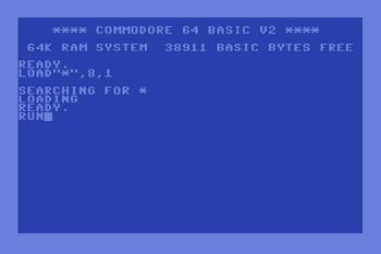
Other ideas started to stem from the idea of a computer based theme whether adapting the look of glitch art which was also featured in my music video to convey themes of a computer virus running rampant or perhaps basing my imagery on old computer manuals to convey not only a computer theme which should do well in communicating the electronic genre but also will help in conveying a retro look to the digipak which would fit in well with the  music,video's use of sampled stock footage of the 80's/90's. When conceiving this idea I was mainly inspired by the artworks featured on Com Truise's Komputer cast compilation albums which feature imagery of old computer models such as the Commodore PET to convey a retro futuristic look to the artist as well as communicating his retro like sounds.

Komputer cast inspiration
Old computer manuals - Inspiration for some of the designs
Other ideas came from more retro technology themes to further explore representing the music video's use of old sampled footage as well as conveying a tech theme found in electronic based music. These ideas included stylising the front cover of the Digipak as an old video game title or perhaps feature a style similar to the pixelated look of BBC's Ceefax or teletext which firstly allows for a pixel based look keeping with the computer theme as well as adopting the look of Ceefax to represent the artists British origin as well as conveying a sense of Britishness among the digipak.

Mock ups of how I could possibly adapt these visual styles of video game title screens and Ceefax/teletext for the cover of my digipak
Finally, one last element from my music video that I thought would be appropriate to explore for the front of my digipak would be utilising the Frank Sinatra theme and visual motif seen throughout and possibly base the front of my Digipak on the design of one of his albums in order to convey the humouress side to the music and music video attached to the digipak.

A mock of how I could possibly parody Frank Sinatra- If I were to develop this idea further I could add a glitch overlay effect making it look more like the robot is glitching and taking over album artwork as well.


In addition to developing ideas for the front cover to my Digipak, I briefly touched upon an idea for the booklet or insert that would be featured in my Digipak. Because my chosen track is electronic based and features very little lyrics one idea I had was to feature extra artwork perhaps consisting of the images taken when filming however overlayed with a typography effect similar to the image below, with the two lyrical parts of the song "like a fever burnin" and "let the love with feel" written all over, to firstly represent the viruses take over and also convey a computer binary code/Anscii art look to it further exploring the music video and possibly Digipak's computer theme. However I also propose exploring whether my artist has other tracks he would like to attach to this album as this may alter the outlook of the interior of my insert.


Moreover, for the exterior one idea I noted on the slide above was to use also use an old computer manual which would in turn allow communicate a software look to the Digipak i.e stylising it like purchasing computer software and thus convey my idea of the title Burnin fever referring to a computer virus. However If I were to use this idea for the insert exterior, I feel that it would best leave it just for the insert instead of the front as too much of this graphical style would clash and render the software look meaningless. I.e. Having a look of a computer manual with another computer manual within it wouldn't make sense.