Digipak analysis - Looking at album art of similar artists
Eric Prydz - Call On Me

The image above is the front cover to Eric Prydz's (
a similar artist recommended via audience) single
"call on me". When analysing the artwork behind the album one notices
that the image used featured on the album is a screenshot from the call on me's
music video thus conveying strong synergy between music video and album art.
Both song, music video and artwork heavy allude to the 1980's which was the decade
in which electronic music was popularised with new electronic and Synth based
genres such as Synthpop emerging as well as the stylistic origins of Prydz's
own genre house music ; a similar form of electronic music. This can be
evidenced in the visuals of both the artwork of Prydz's album and the music
video when looking at the fashion of the models presented on both formats.
Models seen here are seen wearing 80's aerobic fashion such as brightly
coloured leotards and sweatbands. In terms of the song itself, it utilises
samples from popular Synthpop song "
Valerie" by Steve Winwood originally released in 1982 thus
further conveying an 80's attitude and style to Eric Prydz.
This 80's theme can also be seen in the video,
which briefly features a shot of an 80's style boombox, which as a format of
listening music as itself bears connotations of loud music and partying features
one would associate with house music. Perhaps this has been intentionally has
been used for this effect to allow viewers to associate Prydz's work with
celebrations and party's
The use of 80 aerobic fitness theme to the video and album
artwork may represent how the artist wants to portray his music as "active
music" music you listen to whilst dancing or exercising which connotes the
dance style to house music. This 80's aerobic style is further explored in the
type of the album cover as one can see a coverline like message "includes over 30 mins of music. DVD
video format also available!" written on the left hand side which
convey an aerobics VHS cover look to the album cover by adapting such a
conventional feature of these VHS covers to the artists artwork. One could
suggest that such a coverline conveys tongue in cheek humour, which shows us
the audience that perhaps the artist's image is one of light heartedness, such
as humour, happiness and enjoying a good time.
 |
| Similar fashion styles seen here between model of the artwork and women seen on the 80's workout tapes. Not only this but cover lines can also be found on these tapes such as " the all new best selling exercise and diet video! |
Furthermore, the use of an 80's aerobic theme as the main
imagery on the cover connotes more of a happy and enthusiastic theme to the
artist's song and image by referencing a product which is centered around
enticing a sense of enthusiasm and fast pace towards their audiences to
workout more.
Discussing the central image featured on the cover itself,
we see a shot of a woman looking seductively. Overlaid on said photo is a
subtle TV static like filter on the photo, which conveys a grainy and aged look
to the photo. The use of particular shot places the woman on sexual display,
which similar to Calvin Harris' ready for the weekend cover may promote the
artist as sexy and desirable in terms of his artist image as well as to arouse
interest in this particular product among its audience. Furthermore the use the
TV static like filter on the photo not only conveys an aged look but also bears
some reminiscent to 80's visual styles of low quality VHS tapes . This may subtly
show an intertextual reference to technological themes, which tend to be
present similar genres of electronic music and further explores the "old
VHS workout" theme that has been previously established.
When further exploring the graphics used on the cover one
notices a set of abstract shapes in the lower bottom left-hand corner, which
further show a "techy" look to the artwork similar to the TV static
however not so much. On the other hand whilst looking at these shapes as a
whole they appear similar to
music
volume bars on high volume connoting Prydz's style and music as loud party
music. This is further emphasised with the use of the colour yellow can bear
connotation of happy and cheerful moods, which are feelings, associated with
parties and celebrations. These graphics further promote Prydz's music and
artist style as one of cheery and upbeat nature. From these graphics so far it
has been established that you would normally consume his music at celebrations
or situations in which one wished to feel good.
In terms of type the album cover employs the use of large
bold sans serif font which shows a sense of against the retro imagery which may
convey that this artist is a mix of classic 80's style house and electronic
music but is also bringing his own modern style. Moreover, Prydz's name is
highlighted in yellow which similar to
the yellow volume bar like graphics convey Prydz's style as cheery and upbeat
by associating his name with the colour yellow and the connotations said colour
brings with it.
Finally, when looking at the composition of the type on notices
how the texts' alignment to the left creates a similar volume bar look to the type,
which just likes the yellow graphics, conveys Pyrdz's style and music as loud
party music.
When looking at the
back/inside of the cover, the artwork seen opts for a more simplistic look
contrasting colder colours such as dark blue background against the warmer
yellow type to emphasise and draw out the colour and the moods it brings with
it. The back cover features a conventional track list in the same font as the
main font on the front and features the abstract volume bar like graphic which
may be somewhat Prydz's logo for his artist image. If said graphic does
represent some kind of logo to Prydz's style, it would serve as a summary for
the artists style; a way of easily communicating to audiences Prydz fast pace
and upbeat style.
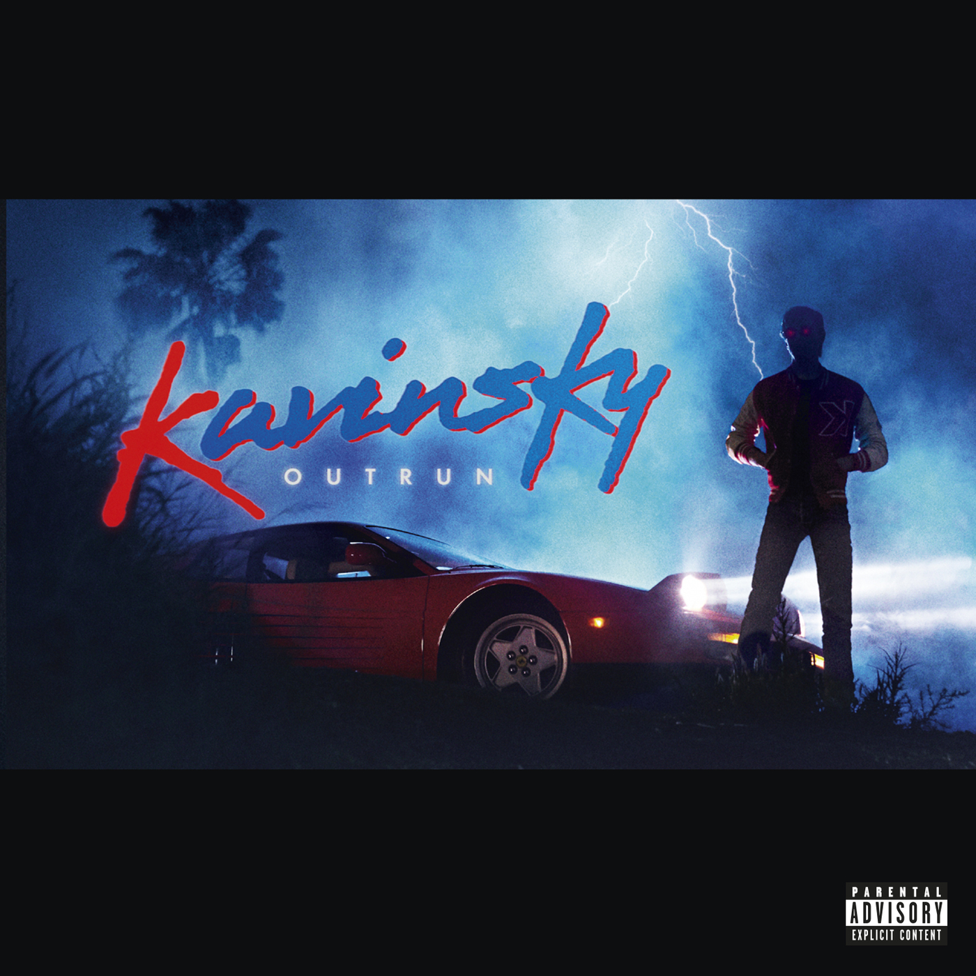
Kavinsky - Outrun

After researching other
artists to look at who work within a similar genre to Prydz and my own chosen
audience, I have decided to look at French house artist Kavinsky and how he
promotes himself and his genre via his own album artwork. Similarly, to Prydz,
Kavinsky seems to opt for an 80's centric aesthetic linking his style of music
and referring to the stylistic origins of house music in the 80's. However
rather than linking to the workout video genre of the 80's to connote an upbeat
and energetic mood to his music Kavinsky seems to be making reference to the
action era of film; an era during the 80's in which action movies dominated Hollywood
film. This can be evidenced via the subject matter depicted on the cover that
first of which applies a letterbox border around the photo to convey a film
frame look to the picture. The photo itself is of a picture of the artist
himself standing upright showing confidence however with his hands in his pockets,
which shows a calm look to the artist and promotes him as being
"cool" and in control which are similar traits exhibited by these
action stars. Furthermore, the artists
face is concealed by darkness creating this mysterious persona to Kavinsky. Perhaps this has been used as a way of
adapting action and thriller movie poster conventions ( i.e the use of shadows
around the face to convey tension and engage viewers) to further convey this
blockbuster action movie look the artist wants to promote himself as via the album
cover. The composition of this cover is very reminiscent of an action film
scene of poster one in particular being the poster to the 80's action film Beverly hills cop.

By using featuring a red fast car to connote danger and a
"cool" strong character as the lead and one of the focuses in the
picture, this conveys Kavinksy's album
and work as more of something of a film score. Kavinsky's music has been
represented here via this cover as something more to entice feelings of adrenaline
and adventure rather than to dance as seen in Prydz cover.
When viewing the music
video to
Protovision a
song featured on the album, Protovision uses narrative based elements which a
car chase between a police officer and Kavinsky in LA which is itself a
reference to 80's action films by adapting the car chase convention of these
films and centring a music video around this. In addition, the particular cars
featured in the video have a more older and "retro" look to them
rather than using more modern looking police cars and sports cars which as a
result further illustrates a retro and 80's aesthetic to the Kavinksy's image
in both video and print productions. It seems that similar to Prydz, Kavinsky
is opting for a retro look to his work.
 |
| Kavinsky -left, Photos of 80's cars - Right |
When thinking about the
link between Kavinksy's music and 80's action perhaps the artist is referencing
to how many of these Action film scores during the 80's used electronic music
and heavy synths to convey tension and thrills such as
Axel F in Beverly Hills cop or the theme to The
Running Man.
This in mind, this may further evidence how
the artist is promoting themselves as more "cinematic" in terms of
their music rather than Prydz's dance centric mood.
A benefit of this would
be the possibility of attracting audiences who grew up with these films via the
use of their nostalgia by offering said audience a similar sound of music to
consume.
The use of colour here opts for a colder palette however
contrasts this with the bright red sports cars, which draws viewers attention
to it immediately and further illustrates this action centric mood to the cover
and towards the product and artist it's promoting. This action centric mood is
also depicted via the use of the lightning bolt in the background, which may
represent the energetic tone of the music that is being promoted as well as
making the scene shown here more dramatic.
The typeface used on this cover is a brush script font,
which was a conventional feature in 80's graphic design thus further conveying
this retro look to the product and artists style. Here this brush script also
has the added effect of conveying a sense of energy towards the artists name
and style via its diagonal placement, which conveys motion, and the large loose
letters shaped like lightning bolts, which emphasise more of a sense of power and
connote an electric feel to the artist.
 |
| A mood board of 80's brush type |
The title of the album outrun is reference to the arcade
game outrun, which was released in 1986 a game, which featured the car on the
front cover. Kavinsky has stated that 1980s video games, television cop shows
such as Miami Vice, which was released in 1984, and the films of Dario Argento
have influenced him, which so far has been evident in the way the artist has
promoted himself via his album cover. The significance of referencing a racing
game at the title of his album may connote to viewers and listeners the fast pace
of the music attached to the song as well as further evidencing the "adrenaline
pumping" mood that has already been hinted at via the music video and some
of the visual elements of the cover. In terms of the type itself, the word outrun
is written in a white sans serif font with large kerning between each character
to convey a cold feeling, which adds to the cold atmosphere of the entire composition.
This also allows the title Kavinsky to convey more energy towards viewers and
emphasises the energetic sounds of the music attracted to this album once
again.
Just like the front, the back of the album keeps with the
cinematic theme by using the letterbox boarder to convey a film frame, however
what the back also adds to this theme is in the particular way it organises and
displays its track list. Keeping with the film theme the tracklist has been
laid out in a style similar to a film posters billing block. From this, it
appears that Kavinsky promoting his album as more of a film in itself in the
sense of films can offer viewers an "adventure" to engage with. Kavinsky
and his music have been represented more overall like an action film which
connotes that the music attached will be fast paced and more of a
"rollercoaster ride" like the action genre.