Sketches of front cover
After going through a range of photos to choose for my Digipak, the slide above here details any developments upon previous ideas mentioned during the post as well as new sketches and improvements upon the design, particularly more in terms of the front cover. Initially I drew a sketch/plan as to how I would develop the image below into more of a Digipak cover.
However, I also explored other potential compositional styles inspired by a range of sources in order to feature the Robots presence somewhere on the Digipak cover to almost adapt the Robot character as Tropiika's persona in terms of artist promotion.
One idea I had was to replace the barbie doll featured in the image with a Lego construct version of the Robot head thus promoting my artists image as well as keeping with the playful and weird theme of the video and hopefully the digipak.
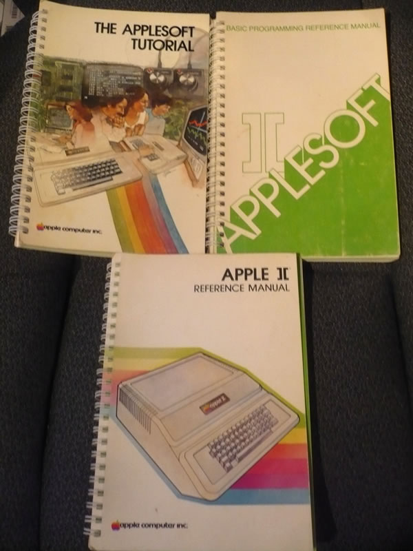
Other ideas started to stem from the idea of a computer based theme whether adapting the look of glitch art which was also featured in my music video to convey themes of a computer virus running rampant or perhaps basing my imagery on old computer manuals to convey not only a computer theme which should do well in communicating the electronic genre but also will help in conveying a retro look to the digipak which would fit in well with the music,video's use of sampled stock footage of the 80's/90's. When conceiving this idea I was mainly inspired by the artworks featured on Com Truise's Komputer cast compilation albums which feature imagery of old computer models such as the Commodore PET to convey a retro futuristic look to the artist as well as communicating his retro like sounds.
 | ||
| Komputer cast inspiration |
 |
| Old computer manuals - Inspiration for some of the designs |
 |
| Mock ups of how I could possibly adapt these visual styles of video game title screens and Ceefax/teletext for the cover of my digipak |
In addition to developing ideas for the front cover to my Digipak, I briefly touched upon an idea for the booklet or insert that would be featured in my Digipak. Because my chosen track is electronic based and features very little lyrics one idea I had was to feature extra artwork perhaps consisting of the images taken when filming however overlayed with a typography effect similar to the image below, with the two lyrical parts of the song "like a fever burnin" and "let the love with feel" written all over, to firstly represent the viruses take over and also convey a computer binary code/Anscii art look to it further exploring the music video and possibly Digipak's computer theme. However I also propose exploring whether my artist has other tracks he would like to attach to this album as this may alter the outlook of the interior of my insert.
Moreover, for the exterior one idea I noted on the slide above was to use also use an old computer manual which would in turn allow communicate a software look to the Digipak i.e stylising it like purchasing computer software and thus convey my idea of the title Burnin fever referring to a computer virus. However If I were to use this idea for the insert exterior, I feel that it would best leave it just for the insert instead of the front as too much of this graphical style would clash and render the software look meaningless. I.e. Having a look of a computer manual with another computer manual within it wouldn't make sense.


No comments:
Post a Comment