
Calvin Harris Digipak analysis
I Created Disco

The image above is a picture of the artwork on Calvin Harris' debut album I created disco. When analysing said artwork one notices the synergy between Harris' artist image in his early music videos and the artwork. Similar to the music videos Harris is presented with a retro look as evidenced by the calculator font which makes reference old technology which said font would normally be found such as the Sinclair calculator and older computers. Said retro look as previously mentioned may connote a sense familiarity with older audiences who grew up with type of graphics, in addition the calculator font and intertextual reference to technology clearly convey the electric sounds of Harris' music and the type of genre the album is; electric house/nu disco. Furthermore when considering the type of "I created Disco" the font is written in a pixel font normal found in old computer software. One could suggest that this choice of font for "I created Disco" may also promote the artist as a sort of disco computer or software. This could also be a way to reference how this genre of music is made normally with a machine such as synthesizer and communicate the type of genre the album is easier to audiences.
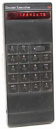

In terms of the artwork itself, it features Harris' previous artist motif the fly eyes which were featured in the video acceptable in the 80's. In addition, the album features Harris' face as focal point, although edited this could've been for reasons that this was his debut album and thus needed his face to be exposed to audiences for promotion and for audiences to know who he is. Moreover, the album artwork bears resemblance to some of Andy Warhol's Marylin Monroe prints. Although not exactly 80's it conveys a similar retro look to Harris' artist image as well as selling the artist as stylish and artistic.
Finally when looking at the colour palette of the artwork, it employs a vibrant yellow which links in with the colourful nature of Harris' older videos as well former vibrant and colourful style.

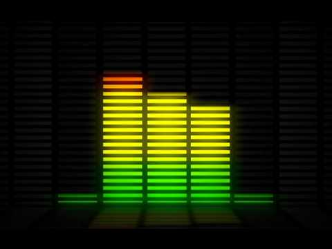
When looking at the back of the cover of I Created Disco similar to the front it employs the use of pixel graphics to allude to retro technological themes. Such pixel imagery also communicates the genre of the album clearly to audiences as mentioned previously on how it makes reference to synthesizers or computer programs which produce this type of music. Furthermore the shape that is formed by these pixels bear resemblance to music volume bars which bear connotations of club/electronic music which relies on different levels of music. The use of this graphic conveys the club/dance mood of the songs featured on the album; one could say it communicates the nature of how the music is best played at high volumes and the upbeat atmosphere of the music.
When considering the layout of the
tracklist, one notices how the list has been placed diagonally which conveys a
sense of motion. Such motion could connote the type of music that is featured
on the track i.e. since the genre of music is nu disco/electro house, one could
argue that instances that this music would be played is at clubs and parties in
which people would be dancing. The motion of the graphics depicts the party
mood of the genre . Moreover the cover also features a contrast between white negative space and a bright block of vibrant yellow which conveys Harris' artist image of bright vibrant colours as evidenced by his previous music videos. Furthermore the bright yellow colour conveys a warm feeling towards audiences; it communicates to the viewers that this is the type of music one would listen when happy or wanting to feel good.
Ready for the weekend

The image above is a picture of Harris' second album ready for the weekend which continues to use the retro fonts such as the calculator and pixel font to convey Harris' retro style and the genre of the album. Whereas in the first album we see a large image of Harris face with his fly eyes motif as seen in ready for the weekend, he has been replaced by a female model. This may be due to the fact that since this is his second album the artist would have a large enough audience following or is well known enough not to be featured on the cover. Similar to his music videos, this album artwork features a woman on sexual display as it appears she is staring at the viewer whilst pouting. This imagery as a result could sell Harris' artist image as sexy and desirable. Moreover the model is wearing Harris' artist motif ,the fly eyes may as a result makes his motif more attractive and fashionable.
Unlike his previous album ready for the weekend opts for black and white colour palette which one could argue connotes a sense of sophistication in contrast to the brighter colour of his previous album.One may could assume that the record company were attempting to sell his artist image as more mature and serious .

The back cover to ready for the weekend follows a similar aesthetic to the front by featuring a monochromatic palette thus conveying the more serious and mature nature as previously mentioned. It appears that the back seems to follow the main image of the model on the front of the album. Unlike the back cover to I created disco, the back cover to ready for the weekend uses a sans serif font which does not communicate Harris' genre directly as much as the pixel font of I Created Disco's back. One may argue that this may further evidence Harris' change in direction of his artist image; promoting the artist as more versatile with his music rather than the retro theme that was previously connoted via the pixel text.
18 Months

Finally the image above is the front cover to Harris' latest album 18 months. Whats significant about this cover is how its dropped previous motifs seen on previous covers such as the retro text, vibrant colours and the fly eyes. One could suggest that this change in the styles of album cover art may represent a shift in artist image over the years. The use of white sans serif font convey neutral look to the cover which in turn connotes a more sophisticated look. Furthermore one could argue that the use of the calculator font to communicate to audiences the type of music Harris produced would no longer be needed since Harris has become a well known artist over the years, people would be familiar with his music by now. In addition the artwork on the poster conveys a more serious tone than the previous albums as it features a long shot of Harris sitting down on a curb with a concerned face. This choice of serious imagery may convey the record companies efforts to sell Harris as much more mature and sophisticated than his previous albums; this could be as a result of selling his work to a wider audience as well as reflect how the artist has physically and mentally gotten older and thus his style of music and interests may have changed.
 Evidence of a more serious tone compared to his earlier work can also be seen in the back of 18 months. Using more sombre imagery of a man alone on a curb; one could argue this may suggest the tone of the work that is featured on the album opting for a more dramatic music and possibly emotional music than Harris' party like and whimsical imagery that was conveyed in his previous works.

No comments:
Post a Comment